

It’s been three posts since we’ve showered, and our XAML is starting to smell a bit. It’s time to practice some good hygiene. Thus far we’ve just dragged elements into our window and resized by hand. For the most part that has worked, up until we ran our last example. Our loon didn’t expand to the entire window and left some gross white space on the right side we need to scrub off. I said this in my MMS presentation, and I’ll say it again:
Drag and drop is fine for simple GUIs, but if you want “polish” then you need to become familiar with your layout options in WPF/XAML.
Unfortunately, due to the limited time I had to present (who would have known 60 minutes flies by so quickly?) I didn’t really get to dive deeper into HOW you’d use “Grids” and “StackPanels”. I was only able to leave you with the basic concepts behind them.
- Grids: Like HTML tables, you have the ability to define rows and columns, and spread controls across multiple columns. The main difference being that grid location (row/column) is defined by the control/element rather than putting things inside a “row” or “column” tag like you would in HTML. This will make more sense as we go along today, but it’s an important distinction.
- StackPanels: These are kind of like “automatic” grids. They “stack” content horizontally or vertically. When combined together (StackPanels inside of StackPanels) you could technically create a sort of “grid” layout, but it’s clunky at best because you’re relying on the width or height of the stacked items to be the same across the stacks to make them even.
I should note that none of this will specifically apply to PoSHPF. This is more or less a base concept of WPF/XAML itself - still good to learn but there won’t be any PowerShell in this post.
StackPanels
As I described earlier, StackPanels “stack” their children either horizontally or vertically. It can be a very useful layout tool when you have a collection of things like buttons. If we drag a bunch of button controls into our window…
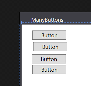

Okay, so I cheated a little bit here. Visual Studio does actually have some helpers built into the design view for XAML that will help you place your controls in a neat line, but if we look at the XAML that’s when things start looking ugly… even if we place them neatly.
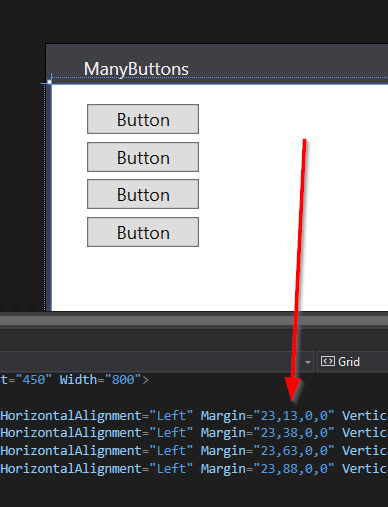
Wait… we’re defining everything by margins? And we’re defining their position in pixels? Eww. Does it work? Mostly.
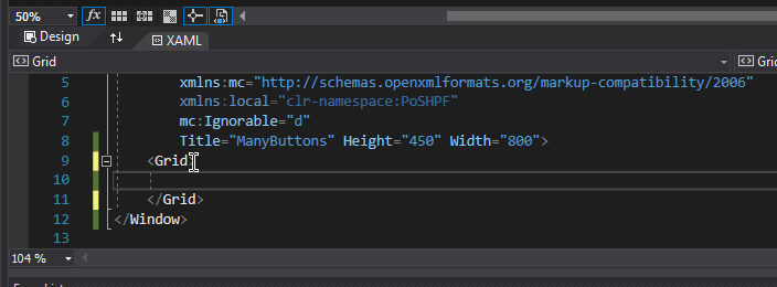
A better approach is to let the margins work for you to space elements, rather than position elements. So let’s start over. Instead of buttons, let’s put a StackPanel in our window. As a matter of fact let’s replace the base “Grid” with a “StackPanel”. All you need to do is just change the word “Grid” to “StackPanel”.
Visual Studio SHOULD be smart enough to change the closing tag for you as well. Now that our window has a StackPanel, let’s put some buttons in it. Drag your buttons into the window like you have done before.
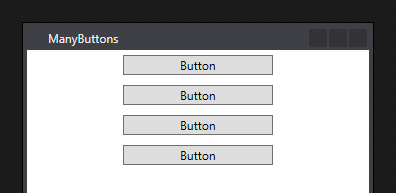
Now, our buttons are literally stacked on top of each other with no spacing between them. This isn’t super pretty either. Also they’re the full width of the window. Which also isn’t super pretty. Let’s fix the spacing first. Give each button a margin of “5” - you can do this by adding an attribute to the button control in XAML or you can do it from the “Properties” window.
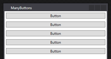
It’s better, but still not fully there. We need to give our StackPanel an idea of where we want our buttons - by default the HorizontalAlignment is “Stretch” meaning, make the controls inside as wide as the StackPanel itself. Let’s instead set this to “Center”. Add the attribute “HorizontalAlignment” to the StackPanel control and set it to “Center”
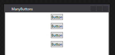
I’d like our button to be a little bigger, but I also don’t want to limit their size if they contain a lot of text. So on each button let’s define a minimum width of 150px. You do this by defining the “MinWidth” attribute on the button to “150”
Something you may have noticed when you set the MinWidth on your first button is that the rest of the buttons actually stretched themselves out. This is because we hadn’t defined an actual size for our buttons so they defaulted to taking all the width available to them, which in this case was 150px + 10px margin (5px left, 5px right). This could be helpful say if you create a button with a LOT of text… say “Supercalifragilisticexpialidocious”
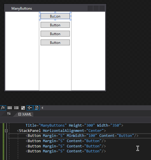
Notice how all the buttons expand to have a nice UNIFORM width as the content inside one button extends past the bounds of the defined minimum width? This is the stuff that will take your GUIs from “absolutely amateur” to “polished professional”
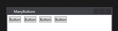
Now we can change the orientation of our StackPanel layout as well. If we’d like our elements to stack Horizontally instead of Vertically (which is the default), we just need to define the “Orientation” attribute to “Horizontal” and also (so that it doesn’t stretch from the top to the bottom) define our “VerticalAlignment” to maybe “Top”
Neato!
Grids
Okay, so StackPanels are cool, but Grids give you a much greater level of control. With more control however, comes more complexity. Let’s break down into a few base concepts:
Sizing Rows / Columns
You can define the size of a row or column in three different ways (and in any combination of these three ways):
- Automatic: use all the space available
- Pixel Perfect: define a specific pixel width
- Proportional Division: asterisk (*) is the base unit, and you assign “multiples” of them to define widths. Imagine three columns, if you gave them the sizes “1* 2* 1*” respectively, we would have 4* wide. Left and right columns would be 25% of the width each, and the center column would be 50% of the width.
Defining Rows / Columns
Unlike an HTML table where elements would be positioned inside of the row or column tag (<tr> / <td>), you predefine your rows and columns then tell your controls where they live via attributes: “Grid.Row”, “Grid.Column”, “Grid.RowSpan”, and “Grid.ColumnSpan”. We do this by creating child nodes under “Grid” called “Grid.RowDefinitions” and “Grid.ColumnDefinitions” and inside those nodes creating “RowDefinition” and “ColumnDefinition” objects. It looks something like this:
<Grid>
    <Grid.RowDefinitions>
        <RowDefinition Height="*" />
        <RowDefinition Height="2*" />
        <RowDefinition Height="*" />
    </Grid.RowDefinitions>
    <Grid.ColumnDefinitions>
        <ColumnDefinition Width="100" />
        <ColumnDefinition Width="Auto" />
    </Grid.ColumnDefinitions>
</Grid>
What we’ve built looks like this:
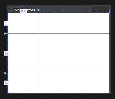
Notice how the rows are proportionally divided (1/2/1), the first column is 100px wide, and the rest of the column is 0 pixels wide (since there is no content inside the column).
Placing Controls in Grids
Okay, so now we need to position our controls within these cells we’ve created. By default a control that is created in a grid will live at Row 0, Column 0 (zero-indexed). To give a control a different position we need to define a Grid.Row and/or a Grid.Column for it to live in. These are just additional attributes we add to the XAML. For a button we might say
<Button Grid.Row="1" Margin="10">Hello</Button>
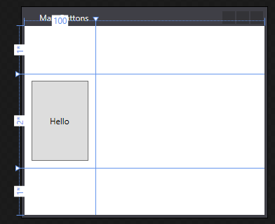
Notice how we have the same “problem” we did with StackPanel. The button takes up as much space as is available, because we have not defined a size for it. What is neat though - since we defined proportional division for the row height if we expand or contract the height of the window, the button resizes with the window. Neato! Now the font size doesn’t change, so we’ll talk about a way to do that with a ViewBox at a later date.
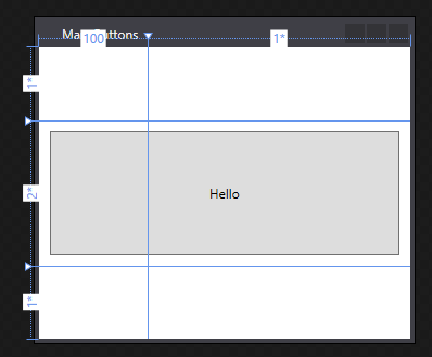
Now if you wanted the button to cover two columns instead of just one, we need to define a ColumnSpan. Again, this is just another attribute on the control - “Grid.ColumnSpan”. If we define this as “2” then the button automatically spans across two cells!
Putting it all together
Okay, so if you’ve been following along, when we use Grids properly we need to do three things:
- Pre-define our Rows/Columns in XAML
- Assign attribute values to our Rows/Columns (Height, Width, etc.)
- Create our elements and position them within the grid
A basic example of this looks like:
<Grid>
    <Grid.RowDefinitions>
        <RowDefinition Height="*" />
        <RowDefinition Height="2*" />
        <RowDefinition Height="*" />
    </Grid.RowDefinitions>
    <Grid.ColumnDefinitions>
        <ColumnDefinition Width="100" />
        <ColumnDefinition Width="*" />
    </Grid.ColumnDefinitions>
    <Button Grid.Row="1" Margin="10" Grid.ColumnSpan="2">Hello</Button>
</Grid>
This is the code that I used to create the last screenshot in this post.
Conclusion
Hopefully now you have the tools necessary to keep your code a bit cleaner and less smelly. If you need any further information on either of these particular controls I recommend checking out https://www.wpftutorial.net/. It’s a resource I have heavily used over my time in learning GUI building in WPF. Until next time, Happy Admining!
Share this post
Twitter
Facebook
Reddit
LinkedIn
Email